
Wednesday, 8 February 2012
Final Poster;
Here is our final poster, We decided on this one being our final poster as it has all the relevant information necessary, the picture is very clear, sharp and precise. This is effective, it still contains features of some of the other posters we came up with. It seems as though whilst looking at this poster that she is staring at you, drawing the viewer into the poster. "did she realise..." is our tag line for our film, which we thought went well with our title. We used the original colours that we chose and used on our magazine cover (red, white and black). We also used common aspects which we saw from our deconstructions and from past experience, such as "In theatres everywhere...", "Starring..." and "from the makers of...". We believe that we used this in the most effective way possible with the tools we had. We added all of the people involved in our film at the bottom of the poster, another common trait, we made sure that we included the name of the person who made the music for our trailer too.


Poster Designs;
We decided to produce more than one poster, this is due to us making a few mock posters and then realising that they all could be used for different purpose's and actually liking all of them and wanting to display them. This post is dedicated to all of the posters that we made. We noticed from doing our deconstructions, that most of the films we looked at had more than one promotional film posters and all for different purposes, so we thought that we would follow this convention with our posters.
 This is one of the posters which we made on 'photoscape'. We think that this one has an extremely eerie feel to it and the lighting makes it that bit more creepy. Also, it contributes to making our main character look more crazy. This poster could be made more for just general promotion, it has been left quite simple, not giving much away, but is striking and does make the audience more drawn to watch the film. By darkening the image we managed to make her eyes look black, this has a scaring effect on the audience, as we can not quite see what her expression is, and almost making her less human by taking away human looking features such as the eyes. The red font used on this poster is to represent blood, danger and death, which can be assumed after seeing this ghostly image behind a deep red title. We made the release date font very large on this poster so that this is the first thing the audience will see.


This is another type of poster that we created. This one is horizontal rather than portrait. We thought that this could be used a banner poster which are often used on things such as buses. Once again it is a simple design with not too much detail, but it is effective, we made it look as though she is looking at who ever is looking at the poster. This is also creepy but an effective technique to persuade people to go and watch the film. This is usually the type of poster which is used to tempt people to go and watch the film at a cinema (from previous knowledge). We used the same red smoke in the background of this poster as what we used in our trailer for the title clips, this is so that they are linked. We put the release date on so that the audience know when it is out at the cinema and are clearly aware of this after seeing the poster. The white writing upon the dark background makes it striking and stand out, also matching the white of our characters eyes, making it stand out to the audience.

This poster was made by using the cinema effect tool on photoscape to get this eerie blue tint and for the background to have some depth but the audience can not quite tell what is there, creating tension and making them fear for what could be there. The way her face lights up and the way she is looking emphasises how she is mad towards this part of the film. the title is once again simple, but is effective, the grey blends in better with the image but still manages to stand out to those who see the poster. We thought that this poster could be used for theatrical purpose and up in the cinemas. We used the popular poster quote "In theatres everywhere..." as this is convention of a film promotion poster and we thought that it worked well and sufficiently added that bit extra onto our poster.
Poster - Editing;
To create our poster we were going to use 'Poster forge' which is software which has been specifically made to design posters. It gave the option to create a motivational, movie or a wanted poster. We planned to make a movie poster, it allows you to simply add a picture and then a title and all of the relevant text where it would usually be placed on a movie poster. However, we decided to just use the programme we used for the magazine cover (photoscape) as we were limited to what we could add and where on the poster we could place the text and we wanted more freedom to experiment with the poster.
Here is an example of a rough attempt at a poster on poster forge:


Poster Photo Shoot;
Preparing and proof of photo shoot;
We had to form another photo shoot but this time we were to make look like the character from the film rather than like a film star out of the film like for the magazine cover. We did this at my house and in various rooms and places in the house to try and achieve effective lighting and angles. Here are a few examples of what we took, from different rooms and places. We used a Fujifilm finepix S (12 mega pixels) camera to take these photographs, this is the same camera we used for the magazine photo shoot.We wanted to use the best camera that we could have access to.


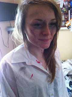

This demonstrates the make-up and the hair process, we made her look as though she is bruised around her eyes and on her face, this makes her look tired, drained and as though she has physically hurt herself. We used bright red gel to make it looks like blood like she has hurt/cut herself too. This will attract the audience to watch our film as they will wonder what has happened to her. This conveys the conventional idea of madness within psychological thrillers. We made her hair big and wild which also follows the conventions of madness within films.
Here is also an example of what we did to take images in different places, angles and lighting. This was tricky due to the natural light still shining through and having to sit on the floor to gain an effective angle.
Results;
We had to form another photo shoot but this time we were to make look like the character from the film rather than like a film star out of the film like for the magazine cover. We did this at my house and in various rooms and places in the house to try and achieve effective lighting and angles. Here are a few examples of what we took, from different rooms and places. We used a Fujifilm finepix S (12 mega pixels) camera to take these photographs, this is the same camera we used for the magazine photo shoot.We wanted to use the best camera that we could have access to.


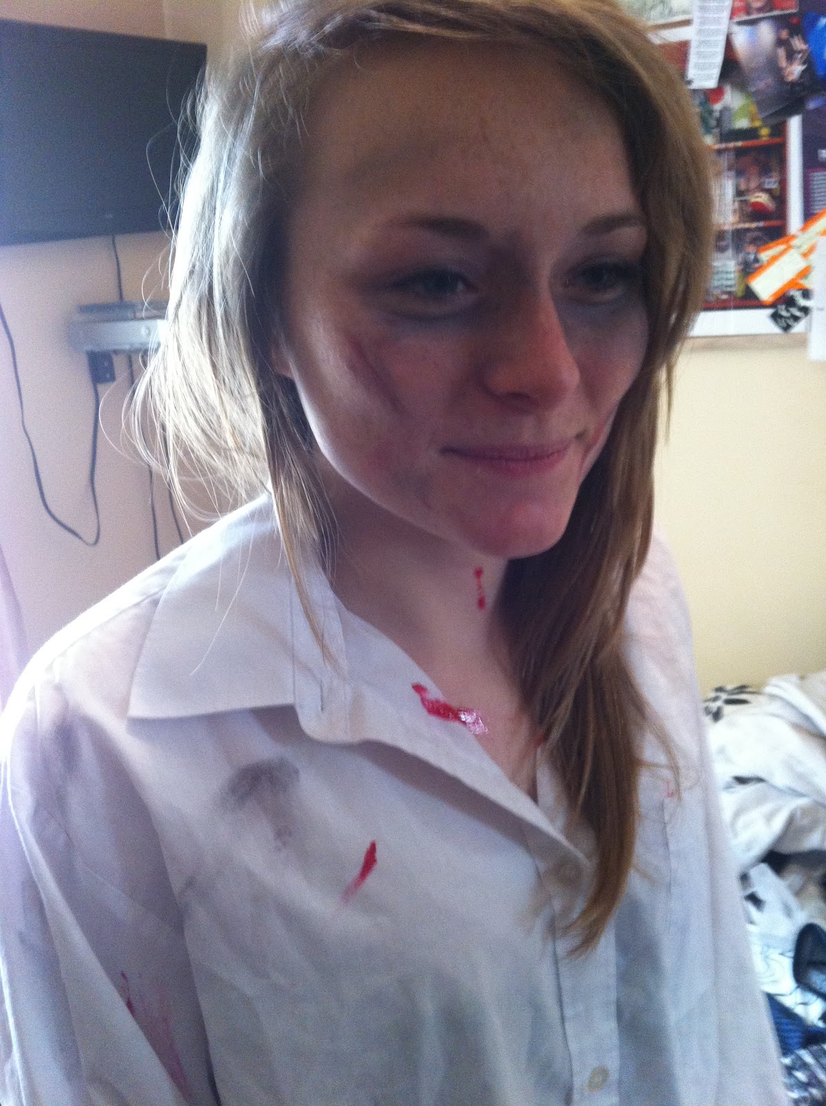

This demonstrates the make-up and the hair process, we made her look as though she is bruised around her eyes and on her face, this makes her look tired, drained and as though she has physically hurt herself. We used bright red gel to make it looks like blood like she has hurt/cut herself too. This will attract the audience to watch our film as they will wonder what has happened to her. This conveys the conventional idea of madness within psychological thrillers. We made her hair big and wild which also follows the conventions of madness within films.
Here is also an example of what we did to take images in different places, angles and lighting. This was tricky due to the natural light still shining through and having to sit on the floor to gain an effective angle.
Results;


Here are some pictures we took which we found to be too dark for our poster although the one on the right shows how we used the bright torch light on an iphone to shine on one side of Sophie's face, this is because we thought it would be effective and if we wanted to make half the side of her head fade into the poster, the process would be made easier by doing so. The one on the left however, was simply just too dark and not very clear.


These photos demonstrate the brightness we gained from the flash in certain area's. They are much clearer and could possibly be made darker and more effective for the genre by editing them on photoscape. The sharpness Here is very good in comparison with the previous photos, which is what we wanted, but the lighting in the previous left one was also how we wanted it to be.


We took these pictures from the inside of a cupboard and shined our bright phone light from underneath her face to create this very creepy, effective image. We thought that this worked well and that we have managed to form various successful images from this shoot. These will be good to show off what genre our film is, although they could be mistaken for horror images, psychological thrillers are closely related.


These pictures were taken inside of a shed, we found that the lighting was too bright for what we wanted and did not have the same effect as the previous pictures. The lighting was not to our liking and the quality was poorer then what we had previously achieved, meaning that we will most probably not be using any images taken in the shed.
Poster - What to Include;
The next aspect of our A2 project is the poster. We previously looked at existing poster's of our chosen deconstructed films and learnt what should be included within our poster. Things which we thought should be included on a film promotion poster are:
-Main image of character from film
-Who's starring in the film
-Title of the film
-Release date
-Website
-Production company and producers names etc
-A quote, statement or catch phrase
-Background
If all of these aspects are included, we will be following the conventions of a stereotypical poster. During the process of creating our poster,from looking at how we worked on the magazine cover I assume we will change and adapt our original ideas as we go along. This means that it can be changed for the better and more suited to what we want as a group and to how we think it looks best.
If all of these aspects are included, we will be following the conventions of a stereotypical poster. During the process of creating our poster,from looking at how we worked on the magazine cover I assume we will change and adapt our original ideas as we go along. This means that it can be changed for the better and more suited to what we want as a group and to how we think it looks best.
Monday, 6 February 2012
Final Magazine Cover;
Here is the final result of our magazine cover. I believe that this went successfully. We followed the conventions of existing magazine covers to make it look professional and realistic. There are some factors which could have been improved on or done differently, but to our best standard, this magazine cover shows all the features we wanted and I am pleased with the end result. It also seems as though it is dedicated to films rather then a general magazine, which has fulfilled our aim of the magazine. The title is eye-catching, the picture looks as though she is dressed as the actress, The website and other features such as the price look realistic too.


Magazine Cover - Editing;
For the editing of our magazine cover we used a piece of software called 'PhotoScape'. We had to download this software as we thought this would be better for editing the main image and producing a successful magazine cover. We also did not have any existing photo editing software on the computers we were using, so felt that this was the best option. We found that this programme was very easy to install and the programme was quick and easy to learn to use and to find our way around.


Here are some print screen shots of our initial editing of the main image for our magazine cover. In order to create this lighting from the original image we had to change certain aspects such as the lighting; the 'brighten' and 'darken' tool. This made the image blend in better with the background and gave the image an oomph. We then changed the tools 'sharpen' and 'contrast' and once we had played around with these tools, came to the conclusion that we had edited the image far too much and the image became pix elated, as we can see from the above print screen. This was due to the fact that we were exploring the new software and did not realise that we had added and changed the various tools and aspects of the image. So we decided that we should start from scratch and use this as an example of our mistake. By the end of this process, we had successfully learnt the nature of the new software.


 This print screen shot is to show the developing process of our magazine cover. It shows the method the programme uses in order to add extra images. Here we can see where we added a small image of our production company logo, this is an extra addition to what we pre-planned what would be included, we thought that it would be effective to show as it could represent that this magazine perhaps prioritises our company, which is the same for many magazines.We also added a small picture of Sophie dressed as the character, to give an insight as to what the film will be like and her role in the film.
 We added a price, bar code, website and the date, this makes it seem more realistic and follow the conventions of existing magazine covers. The writing we included is simple and short, but relevant. 'Top 10 films this Christmas inside!' is used to show the reader what else will be involved in the magazine, and as we planned our film to be released in December, Christmas is relevant. We said 'Latest reviews...' this is a good twist as the title of our magazine is 'Latest' making our cover more quirky and interesting to the reader. Our tag line was - 'D.I.D you? Did she realise?' which combines the title of our film and then an added, catchy sub-title. This does not give too much of the plot away, but does intrigue the audience and leaving them wanting to know more.
Subscribe to:
Posts (Atom)